
PureSolution / stock.adobe.com
It’s 2017. That means you can no longer ignore this little thing called mobile-friendly design when it comes to WordPress. But not all of us are huge enterprises with millions in the bank, right? So if you’re just a regular old WordPress user, how can you make your WordPress website mobile-friendly for free?

Therein lies the rub! It might seem like a tall order, but there are plenty of basic principles you can implement by yourself to improve the mobile-friendliness of your site. And I’m going to discuss all of them.
Here’s everything I’ll cover in this rather lengthy post:
- Why it’s essential to make your WordPress site mobile-compatible
- A free tool to test your site’s mobile friendliness
- Some simple ways to make your WordPress site mobile-friendly for free
- Two different ways to create an app version of your WordPress site
I’m going to go into detail here…so I hope you’ve got a fresh cup of coffee! Let’s get started…
The Lowdown On Mobile Friendliness as a Goal
The face of the web is changing. Ten years ago, you wouldn’t even see a post about mobile-friendly design, let alone one harping on it is an important goal for your site. Now, that’s all changed.
In 2016, mobile browsing surpassed desktop web browsing for the first time ever. Yup, mobile traffic accounted for a stunning 51.3% of worldwide traffic. And while desktop is still the slight leader in the USA (accounting for 58% of all traffic), the trends are definitely moving everything towards mobile.
So I guess what I’m saying is this…soon, we might see posts on “why you still need to make your website desktop friendly”. That’s a bit of a joke, but the trends are moving in that direction. There are already movements like “Mobile first” that advocate a mobile focus for web design.
Beyond just generally making your site accessible to one of the most popular ways in which people browse the web, mobile-friendly design can actually help your WordPress site rank higher in Google’s mobile search results.
That’s because Google has a specific mobile-friendly algorithm that they apply to their mobile search results. As a result of the algorithm, mobile-friendly sites get a ranking boost in mobile search results. A part of this encompasses ensuring your online store is mobile-friendly as well, which you can learn more about from ECommerce Booth.
In any case, when you consider that the majority of Google searches happen on mobile now, that’s a pretty huge incentive!
How Mobile-Compatible Is Your WordPress Site…Right Now?
Ok – you know that mobile-friendly design is important. But how can you figure out:
- What mobile-friendly design is
- Whether or not your WordPress site is mobile-friendly right now
That’s what I’ll cover in this section!
What Does Google Consider Mobile-Friendly?
Thankfully, you don’t have to guess when it comes to what constitutes mobile-compatible design for your WordPress site. Google has actually put out specific guidelines for mobile friendliness. Here’s what Google says to avoid when trying to make your WordPress site mobile-friendly:
- Unplayable Content – make sure that any content sources you include play on both mobile and desktop.
- Small font sizes – Google recommends a minimum of 16px for mobile fonts.
- Touch elements that are too close – Fingers are fat! You need to give people enough space to touch the correct element.
- Incorrect viewport – make sure you mobile page sets the viewport properly.
Beyond Google’s guidelines, you can also find plenty of resources from web designers on mobile-friendly design. A great place to start is Smashing Magazine’s Guidelines For Mobile Web Development.
How to Use Google’s Mobile-Friendly Checker Tool
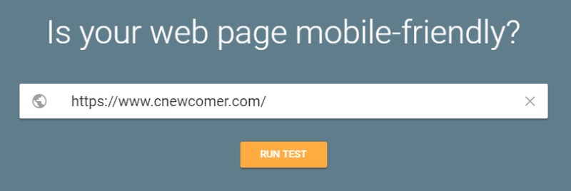
So how can you tell whether or not your existing WordPress theme is mobile-friendly? It’s actually pretty dang easy thanks to a tool that Google put together.
All you need to do is head here. Then enter the URL of the site you want to check and click RUN TEST:
Google will analyze your page and tell you how mobile-friendly your current design is:
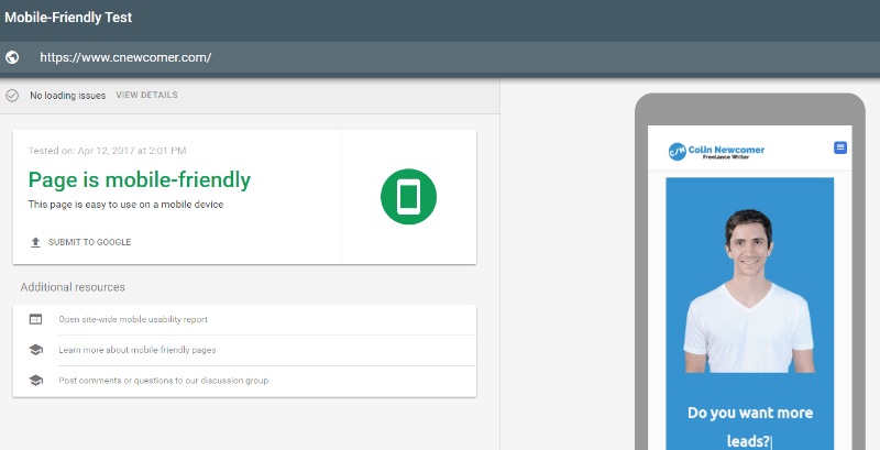
Looks like my site is mobile-compatible already! But is yours? Let’s see how you can make your WordPress site mobile-friendly for free!
How to Make Your WordPress Website Mobile-Friendly for Free
Below, I’ll get into some tips for how to make your WordPress site mobile-friendly for free. I’ll cover everything from major decisions like theme and plugin choice to smaller things like limiting popups and Google AMP.
Let’s dig in.
Use a Responsive WordPress Theme
This one might seem obvious, but the fact of the matter is this:
It’s much easier to pick a mobile-compatible WordPress theme than it is to go back and retrofit an existing WordPress theme to be mobile-friendly. And that process certainly isn’t free!
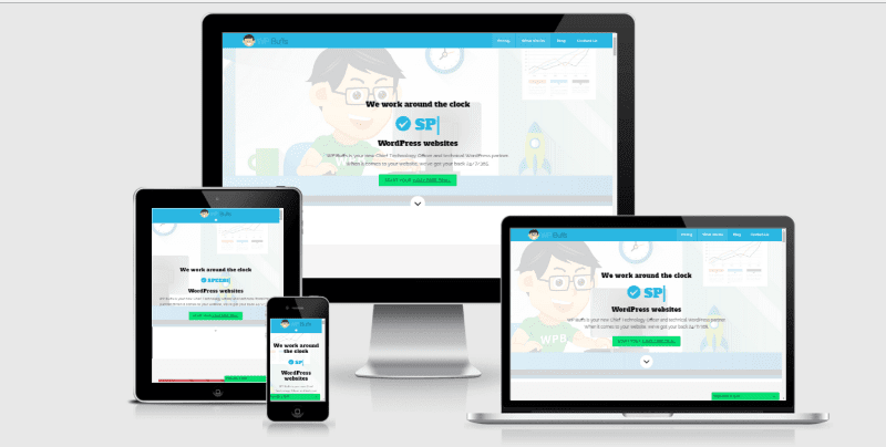
So if you want to make your WordPress site mobile-friendly, make sure you pick a theme that’s responsive. If you’re sticking to free themes, everything at the WordPress.org theme directory is responsive nowadays.
And the same goes for pretty much every single other theme out there. But just because a theme has implemented basic responsive design principles, that doesn’t mean it’s 100% mobile-friendly.
So…how can you figure out how mobile-friendly the WordPress theme you’re looking at actually is? For that, I have a little trick!
See, most WordPress themes provide a demo site for you to preview what the theme looks like in a live environment. Well, all you need to do is take that demo site’s URL and plug it into Google’s Mobile-Friendly Test tool:
For example, the shot above tells us that ThemeIsle’s popular Zerif Pro theme is 100% mobile-compatible.
So, before you choose any WordPress theme, make sure it’s actually mobile-friendly by going beyond looking for the “Responsive” designation.
Or…Use a Different Theme for Mobile
One caveat – I do NOT recommend this approach for the vast majority of WordPress sites. But if you’re in love with your current theme’s desktop look, but not happy with its mobile friendliness, it’s actually pretty easy to use a different theme for your mobile traffic.
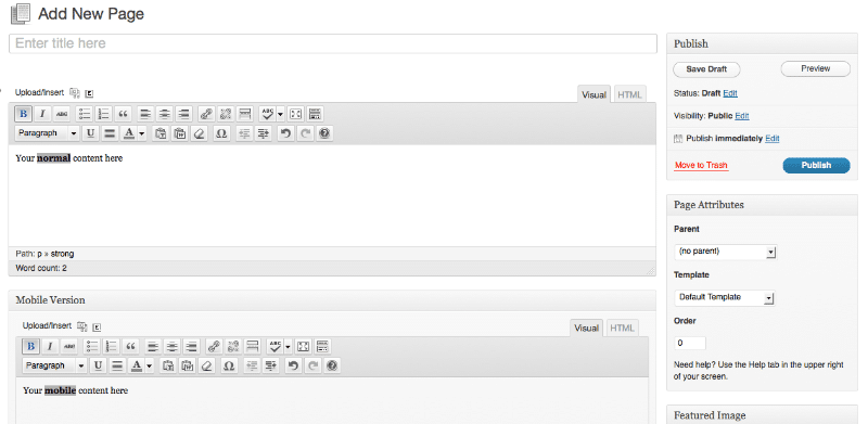
A free plugin called Mobile Smart lets you use a different WordPress theme depending on each visitor’s device. Or, you can simply use different WordPress templates to work within the same theme.
The pro version also lets:
- Specify different versions of your pages for different devices
- Send mobile traffic to a different URL
- Disable specific plugins on your mobile site
- Control widgets/shortcodes depending on a visitor’s device
You can also find plenty of other WordPress mobile plugins to help you out.
Personally, I think using a single responsive theme is still the best approach. But Mobile Smart is a great option if that’s not currently possible for your situation.
Make Sure Your Plugins Follow Responsive Design, Too
Here’s an oft-overlooked facet of WordPress mobile friendliness:
It’s not just about choosing a responsive WordPress theme. You need to make sure that every single plugin you install also operates on responsive design principles.
For example, if you install a plugin that adds a contact form to your WordPress site, you better make sure that contact form looks great on both desktop and mobile.
Unfortunately, there’s not really an automated test for this one. Instead, you’ll need to manually check whenever you install a new plugin.
You can either:
- Use your own smartphone to see how the plugin looks on mobile
- Use a site like Am I Responsive to see how the plugin functions across a variety of different devices
- Use your browser’s Developer Tools functionality
Using a Page Builder? Take Advantage of Responsive Controls
Page builders are pretty dang popular these days. But if you’re not familiar, they basically allow you to create complex designs without needing to know any code. Usually, you use a simple drag and drop interface to move “elements” around.
So how do page builders tie into making your WordPress site mobile-friendly? Because most page builders let you enable or disable elements depending on the device that your visitor is using.
For example, let’s take a look at my personal page builder of choice, Elementor. Say I have an image that looks great on desktop…but crowds the page on mobile or takes forever to load.
All I need to do is uncheck a box to ensure that the image doesn’t display on the mobile version of my page:
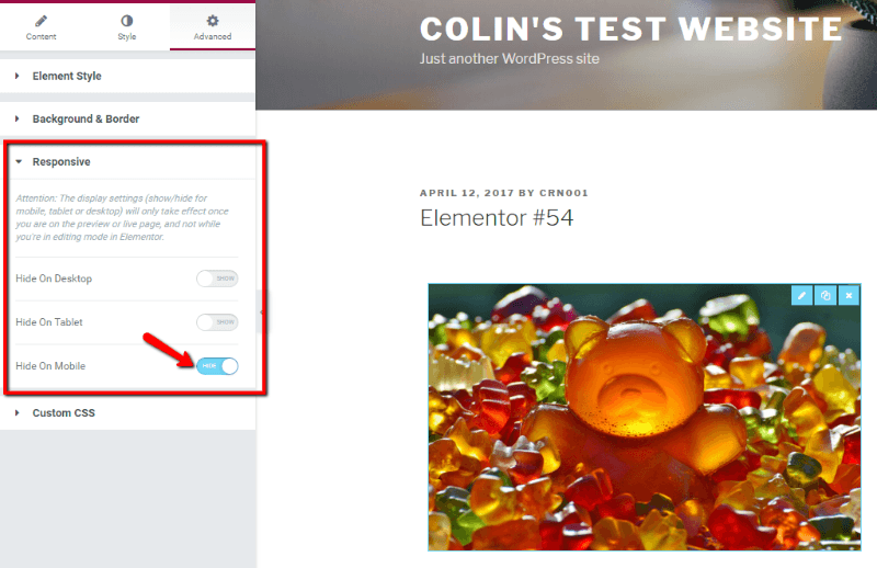
You can use these settings to ensure that:
- You have proper spacing for touch elements
- All the content on your mobile site is playable
- Your mobile site isn’t overly crowded
So if you’re using a page builder, it’s worth picking one that allows you to implement responsive page designs.
Limit Aggressive Popups on Mobile. Especially on the First Page
This one is super easy because all it requires is not doing something. Instead of adding some new techniques, all you need to do is refrain from showing popups on the mobile version of your site.
Why? Because in addition to just plain annoying mobile visitors and violating Google’s mobile-friendly design standards, it also negatively affects your site’s rankings in mobile search.
That’s because Google rolled out a mobile ranking penalty for sites where “content is not easily accessible to a user on the transition from the mobile search results”. This penalty has been active since January 10, 2017.
So, don’t use popups or mobile interstitials on your site’s mobile pages. Especially not for the first page a visitor hits after coming from the Google search results.
Consider Integrating Google AMP for WordPress
If you’re not familiar, AMP stands for Accelerated Mobile Pages. It’s a Google-backed initiative to speed up mobile page load times by serving up a stripped-down version of a page.
If you’ve searched for anything on Google mobile search, you’ve probably come across sites marked with the AMP designation:
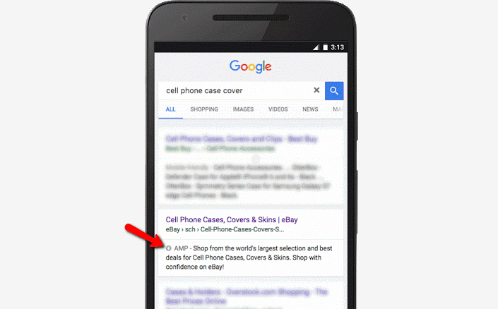
So what’s the benefit of Google AMP for WordPress? While you do give up some control over how your mobile site looks (because the code is stripped down), Google AMP pages are inherently lightning fast and mobile-compatible.
So if you want to quickly make your WordPress site mobile-friendly for free…AMP is a great option.
It’s also super easy to set up Google AMP for WordPress. There’s even an official plugin from Automattic to help you do it!
Pretty much all you need to do is install and activate the AMP plugin. Then, your site will start serving up AMP content to mobile visitors from Google. And if you’re looking for a detailed how-to guide, give this a read: Google AMP – How to Implement it in WordPress
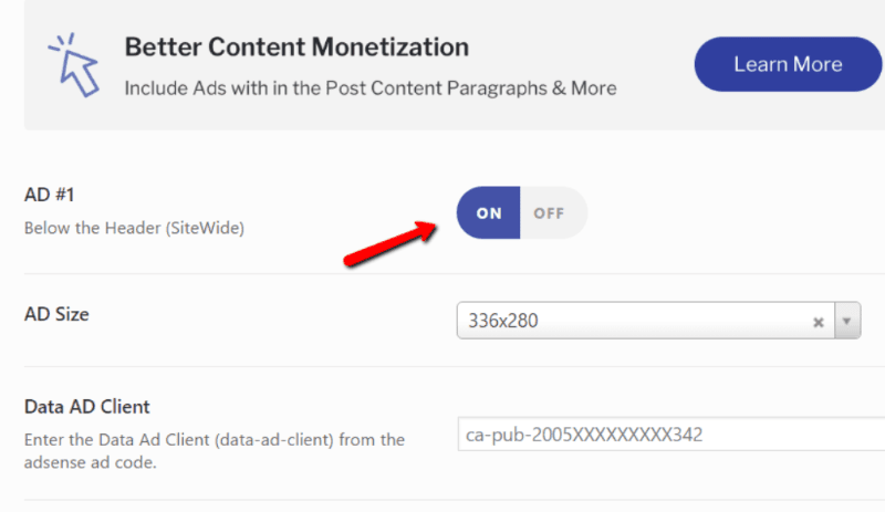
If you want more flexibility over how your WordPress AMP content looks, the AMP for WP plugin is a great option. It builds on the official AMP plugin with new styling options, as well as options for adding ads and social sharing buttons:
If you’re concerned about the SEO-impact of your Google AMP WordPress pages, here’s two important things to consider:
- The AMP plugin automatically adds rel=”canonical” tags to your AMP content, so you don’t need to worry about any duplicate content penalties.
- You can ensure that your Yoast SEO settings carry over to your AMP content by installing the free Glue for Yoast SEO & AMP plugin. Additionally, All in One SEO supports Google AMP in the core plugin, as well.
Going Further – Turn WordPress Into a Mobile App
Ok, the above tips are all about making your basic WordPress site mobile-friendly. But if you want to go all in on mobile, you can actually take things much further than basic responsive design.
I’m talking about apps! See, there’s a debate going on about whether it’s best to go with responsive web design or a mobile app.
Now, I won’t pretend to have the knowledge to weigh in on that debate…but I do know exactly how you can turn your WordPress site into a mobile app.
So if you are on team mobile app, here’s how to turn your WordPress site into either a:
- Progressive web app
- Native app
What’s the difference?
Progressive web apps are sort of a hybrid between responsive design and native apps. They’re still technically a “website”, but they function much like an app would.
Native apps, on the other hand, are actually installed onto your visitor’s smartphones.
How to Make WordPress Into a Progressive Web App for Free
To create a progressive web app version of your WordPress site, you can use a nifty freemium plugin called WordPress Mobile Pack.
In the free version, you can create a basic progressive web app version of your site. To get started, all you need to do install and activate the free WordPress Mobile Pack plugin.
Then, you can get your progressive web app up and running in just a few minutes. Start by adding your logo and configuring color schemes and styling options:
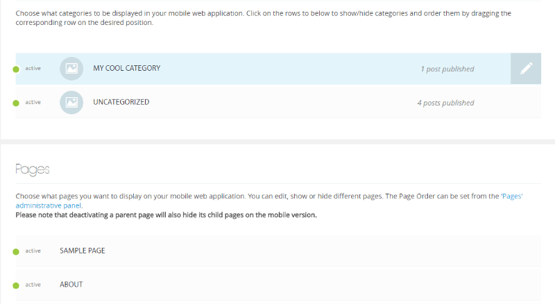
Then, choose the content you want to include in your app. You can include everything, or just select specific categories or pages to include. This is a great option if you have some content which just doesn’t lend itself to mobile:
And that’s pretty much it! You can explore the other options to add Google Analytics tracking and configure who sees your progressive mobile app. But there’s nothing else that needs to be done.
What Do You Get in WordPress Mobile Pack Pro?
If you want to go all in on your progressive web app, you can purchase the pro version to get access to:
- More styling options
- Additional app themes to easily change up the whole aesthetic
- Options to include advertisements into your progressive web app
The developers are also working on additional extensions that let you add functionality like:
- Push notifications
- Offline mode
- HTTPS
- A solution to download a native app version of your progressive web app for the best of both worlds
How to Turn WordPress Into a Native App
Unfortunately, because the process of converting your WordPress site into a native mobile app is a fairly complex, most of the plugins cost a bit of money. So if you’re serious about creating a native mobile app version of your WordPress site, you’ll need to crack open your wallet and pay for a premium plugin.
While there are several plugins purporting to do this, your three most popular options are:
- WordApp
- MobiLoud
- AppPresser
How Does WordApp Work?
WordApp lets you create both Android and iOS native apps from your WordPress site. Best of all, you can actually create the Android app for free, though you’ll need to pay for the iOS version.
Creating your app only takes about 5 minutes and you’ll even be able to send your app users push notifications directly from your WordPress dashboard.
Even if you go with the paid version, WordApp still costs less than $10 per month.
How Does Appmaker Work?
Appmaker lets you convert your WordPress and WooCommerce sites to Native Android and iOS WordPress/WooCommerce apps.
The pricing is custom and you can get an estimated cost after contacting their app experts. The company prioritizes quality and performance above all else, so while pricing may be higher than competitors they abide by the mantra, “you get what you pay for,” so to speak.
How Does MobiLoud Work?
With MobiLoud, you install the free plugin and sync it up with your paid MobiLoud account. Then, MobiLoud builds out a native app version of your site for both iOS and Android.
You’ll get your own logo, icon, and launch screen. And MobiLoud will even handle the submission process.
Currently, MobiLoud’s cheapest plan starts at $69 per month when paid monthly. They also have more feature-rich plans which go up in price.
How Does AppPresser Work?
With AppPresser, you create your native mobile app in the AppPresser interface. Then, AppPresser gives you a dedicated plugin to sync your WordPress site with your native mobile app.
While you build you app yourself, don’t worry! You don’t need to know any code to build your native WordPress app. Everything is done via a visual builder, which is super neat. Obviously, you’re not going to create the next Flappy Bird with the visual builder. But for a simple app version of your WordPress site, it’s totally fine.
AppPresser offers a few different plans:
- Starter – a basic plan for $199
- Woo – a plan targeted towards WooCommerce stores for $399
- Agency – designed for agencies at $499
While none of them are 100% free for iOS and Android, all of them are good solutions for turning WordPress into a native mobile app.
Wrapping Things Up
Phew! We covered a lot, didn’t we? After reading this post, you should know everything from why it’s important to make WordPress mobile-friendly to how to turn your WordPress site into a nifty mobile app.
If you’re just a casual WordPress site user, you don’t really need to concern yourself with apps. Just follow the basic mobile-friendly design tips like responsive design, eliminating popups, and maybe installing Google AMP for WordPress.
If you’re running a serious business on WordPress, though, you need to spend a bit more time on making your WordPress site mobile-compatible.
As some of the stats I discussed illustrated, mobile traffic is not going away anytime soon (quite the opposite, actually!). So if you want your business to be successful, investing in mobile-friendly design will pay dividends down the road.