
sitthiphong / stock.adobe.com
Having a mobile-friendly site has become more of a necessity than an option. However, while there are multiple ways to create a mobile version of a website, the most practical and beneficial is to use a media query for mobile.

Responsive design and media querying provide solutions for ensuring your website automatically adapts across all devices and screen sizes. They are central and complex topics that, once you grasp the concept of, will make creating responsive sites much easier.
In this guide, we’ll explain what responsive design is, how it works, and the technology that makes it tick. We’ll also discuss how to implement and use responsive media queries for all devices and provide some troubleshooting tips. Let’s get started!
In This Article 👁
What Is Responsive Design? 🧐
When Google first started emphasizing the importance of mobile-friendly sites, the web design community responded in several ways. We saw mobile sites on separate domains with automatic redirection.
There were also specialized mobile WordPress plugins to create smartphone-friendly site versions. Some designers simply ignored what was going on and hoped people would get used to zooming and panning.
However, now the preferred and popular solution is to use ‘responsive design’. The term was coined by Ethan Marcotte in 2010. It describes an approach to web design aimed at making websites conform to the device used to access them.
In more technical terms, it means that the size and position of site elements ‘respond’ to the so-called viewport. This is the area a site is visible in, and it is constrained by both the size of the device and the browser window used by the device. The goal of responsive design is to make accessing sites as comfortable as possible for visitors without the need for zooming, scrolling, and resizing.
The best way to experience this is to go to a mobile responsive website on a desktop computer and slowly shrink the browser window with your mouse. This will make gradual design changes obvious. (Hint: You can try it right here on WP Buffs.)
How Does Responsive Design Work? ⚙️
Responsive design is based on a few main principles. The most important of them is the use of proportionate sizes instead of absolute measures. This means website elements are declared in percentages and other responsive measurements, rather than static units such as pixels.
Below is an example of how site element sizes used to be declared:
.content {
width: 780px;
}
Declaring sizes this way resulted in a rigid grid (a grid being the main structure of a website including header, footer, content, sidebars, etc.). As a result, no matter what size device you used to view a website, it would always look the same, and people on smaller screens had to pan and zoom to see all parts of it.
Today, we have what is called a fluid grid. This uses proportionate measurements and is thus able to conform to the size of the viewport instead of the other way around. Here’s an example of how that looks in CSS:
.content {
max-width: 68%;
}
Aside from that, responsive design has to take into account different usage patterns of mobile users, especially the use of touch instead of a mouse or trackpad. This makes it necessary to consider hover effects, the shape, size, and positioning of buttons, and other clickable elements such as menu items to make them usable.
What Are CSS Media Queries in Responsive Design? 🔌
At the heart of responsive design is CSS. For the uninitiated, this part is responsible for the styling of a website. While HTML builds the skeleton and JavaScript adds functionality, everything that looks nice is usually CSS: font types, sizes, colors — all of it.
CSS is so central because it determines object sizes (as we have already seen). It’s here that we use our proportionate measures. However, there’s something even more important for making websites look good on mobile: CSS media queries.
Media queries have been around since 2009. They are operators that let you (and other designers and developers) add conditions to your styling. For example, you can tell a browser to apply a color to an element only at a certain screen resolution, orientation (landscape or portrait), or size.
A common use case for this is telling the browser to move the sidebar below the main content once the screen size dips below, say, 600px. We will talk about how to find the right breakpoints and set the right responsive media queries for all devices further below.
Aside from media queries, there are other important CSS considerations. One of the most important is images and, more specifically, making sure they adapt to the space they appear in. Typically, this is achieved by setting their max-width to 100%:
img {
height: auto;
max-width: 100%;
}
For fast loading images, WordPress developers have come up with an awesome solution. Since version 4.4, they have made it so browsers are automatically served the smallest possible image size via the srcset HTML attribute. This saves bandwidth, which makes everything faster.
How to Use Media Queries for All Devices 👩🏼💻
Alright, now it’s time to get down to the nitty-gritty. In the following sections, we’ll discuss how to use CSS media queries and provide some use cases to demonstrate what they can do:
What a Typical Media Query Looks Like
Before we break down the specific media queries you can use for different devices, it’s important to first understand what a typical one looks like. If you look into the style.css file of any top responsive WordPress theme, you will see something like the following:
@media only screen and (max-width: 480px) {
/* your CSS here */
}
As you can see, each query starts with @media (hence the name). It can define conditional styles for different media types or devices. only screen means that the following rules apply to computer screens, tablets, etc. An alternative is speech, which would target screen readers.
Everything after and is the condition under which the CSS that follows is applied. Other options are not and only. These conditionals also allow you to string several conditions together.
In our above example, the query sets a condition for applying the following CSS only to screens and when the screen size moves below 480px. This is typical of a media query for all mobile devices.
Overall, this format is pretty much the most common media query you will find in responsive design. It’s also our preferred method.
Note: In media query CSS for all devices, min and max can also be used interchangeably. However, some people prefer to define ranges between screen sizes with min-width and max-width.
There are a number of other operators you can input. If you’re interested, you can learn all about them here. For now, let’s move on to where to place your media queries.
Where to Place Your Media Queries
As we mentioned, you can usually find media queries in the style.css file of popular and responsive WordPress themes. If you’ve seen them, you may have noticed that they’re typically located at the end of the file.
This is because browsers read stylesheets from top to bottom. Anything that is at the bottom overwrites any rules at the top (unless you explicitly declare for that not to happen with !important).
So, if your standard font size is 18px (as defined at the beginning of style.css), you can change the font size for smaller screens by adding a media query below, such as:
@media only screen and (max-width: 480px) {
body {
font-size: 20px;
}
}
It’s also possible to declare different stylesheets for different screen sizes so the media queries aren’t all in the same file. However, that’s beyond the scope of this piece.
So far so good? Okay, to really hammer home how to use media queries, let’s look at some additional use cases for various devices.
Media Queries for Mobile Devices
The media query we included in the previous section can be used to create a mobile version of your site. You can also adjust the media query mobile conditions to target specific devices and, more specifically, screen sizes.
For example, for an iPhone 5, you could use the following CSS for both landscape and portrait mode:
@media only screen
and (min-device-width: 375px)
and (max-device-width: 812px)
and (-webkit-min-device-pixel-ratio: 3) {

}
Note: You can refer to this resource to find the exact screen size of a particular smartphone. CSS-Tricks also offers a helpful list of standard media queries for each device.
Beyond that, there are a handful of media query use cases that may come in handy. For example, a common CSS media query for mobile devices is to change the menu style, since these devices often have completely different requirements for menus. The typical horizontal menu used on desktop screens doesn’t work on a phone because it makes buttons too small to tap on with a finger.
For this reason, many themes contain markup to change to a responsive menu (complete with burger icon) below a certain size. For example, if you shrink your browser on our WP Buffs website, you can see this in action.
On a standard desktop screen, our home page navigation menu looks like this:
However, once you shrink the browser window, it changes to this:
Another popular way to use a media query is to move the sidebar below the main content section. This is a common maneuver in responsive web design.
It makes no sense to cram the screen of a mobile device with content, especially when the phone is in portrait mode. A common CSS media query example in modern stylesheets looks like this:
@media only screen and (max-width: 600px) {
.sidebar {
float: none;
width: 100%;
}
}
Rather than move content around, you may just want to hide it completely. This usually makes sense if the content doesn’t add value to mobile users or if loading it could take too long. In that case, you could use the following to disable it:
@media only screen and (max-width: 480px) {
.large-image {
display: none;
}
}
You can apply these media queries for other devices, such as tablets, as well. Of course, you’ll want to consider the appropriate min and max width for them.
A bit further in this post, we’ll take a look at common screen sizes and breakpoints. However, first, let’s quickly look at some examples of media queries for other devices, including tablets, iPads, as well as for desktop computers.
Media Queries for Tablets
As with smartphones, there are a wide variety of tablet screen sizes. Generally, you can use the following CSS media query for tablets:
@media only screen and (min-width: 768px) and (max-width: 1024px)
Additionally, you can use pseudo-elements in your media queries to change the design of your buttons. Again, this isn’t specific to tablets, but we’re including it here because the screen size of tablets versus smartphones offers a bit more space and flexibility.
Pseudo-elements are relatively new in the web design world. They can apply specific styles to different portions of an HTML element. Here’s how you can use them to apply different layouts to a login button depending on screen size:
.username:after {
content:"Insert your user name";
}
@media screen and (max-width: 1024px) {
.username:before {
content:"User name";
}
}
@media screen and (man-width: 480px) {
.username:before {
content:"";
}
}
(Thanks to Tomislav Krnic for that example!)
Media Queries for iPads
Many people consider iPads as tablets. However, since they’re technically not categorized as such by Apple, we’ll give them their own section.
One of the benefits of using media queries to target iPads is that you can use the same one for nearly every iPad generation, from iPad 1 to iPad Mini. To create a responsive design that translates well on these devices, you can use the following lines of CSS:
@media only screen
and (min-device-width : 768px)
and (max-device-width : 1024px)
This can also be used for both landscape and portrait orientations. If you want to target iPad Pros, you might consider adjusting the max-device-width to 1366px.
Media Queries for Desktop
Unless you take a mobile-first approach to web design, you probably create your site for desktop computers. However, using responsive media queries is a smart idea because you want to make sure you’re delivering a solid User Experience (UX) even if a visitor is using a tiny browser window.
As you might recall from earlier in this post, changing the size of the browser can have a major influence on the site layout and usability. Incorporating a CSS media query for desktop can prevent it from looking distorted.
In most cases, it makes more sense to define a media query based on popular screen sizes, rather than specific devices. The latter can cause some issues, which we’ll discuss shortly.
At this point, hopefully you understand the basics of how to use media queries and why they’re so important in responsive design. However, we still want to discuss the most common screen sizes and setting breakpoints, which can be tricky.
What Are the Most Common Screen Sizes? 🖥
As mentioned earlier, there are many different devices out there with varying sizes, resolutions, and orientations. So, at what point should you change the design? To answer those questions, let’s first look at some statistics.
In order to figure out the right responsive media queries for all devices, let’s take a look at some statistics. According to StatCounter, the following are the most popular screen sizes on the internet (September 2020):

In numbers:
- 360×640 — 11.93%
- 1366×768 — 8.95%
- 1920×1080 — 8.28%
- 375×667 — 4.28%
- 414×896 — 3.24%
- Other — 39.33%
From here, we can easily conclude that it’s best to go for three sizes: desktop, tablet, and phone. Now it’s time to figure out our breakpoint. Put simply, a breakpoint is something you can add to your media query where the design elements on either side of it will behave differently.
If you’re using three screen sizes, you might add two breakpoints: one at 768px and one at 360px. However, this doesn’t consider that mobile devices also work in landscape orientation, which calls for two more breakpoints, one at 640px and one at 1080px.
When you look at the StatCounter data, you can see that the largest group is actually made up of undefined sizes (over 39%). How are you supposed to optimize for those?
Media Queries for Common Device Breakpoints
As you can see, trying to set responsive media queries for all devices gets confusing fast, especially if you are in the habit of defining media query CSS min and max. This isn’t to say there isn’t merit in looking at the statistics. It’s actually a smart idea to get a general sense of your breakpoints.
However, in the end, a better idea is to define your breakpoints according to your design. Rather than setting the breakpoints for specific gadgets, it’s more prudent to look at where they are necessary. This way, you won’t have to optimize for hundreds of existing phones and tablets. You can make the design speak for itself.
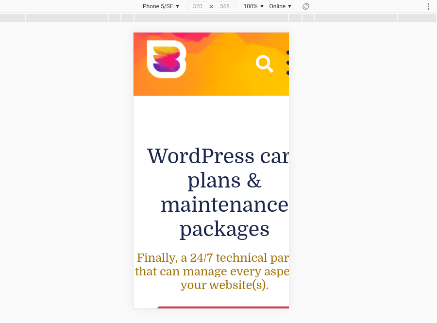
The best approach is to always start with mobile. Take your design and shrink your screen to the smallest possible size. If you don’t have any media queries in place, it will probably look horrible. For example, below is our website after we turned some of the media queries off:
So, this is your first task to fix. You may not have to change the entire layout, but rather an element or two. Note: You can use the Chrome and Firefox Developer Tools to create different viewport sizes, including ones bigger than the screen you’re currently using.
The goal is to make it look acceptable. Slowly expand the screen and watch the layout behavior:

When you get to a point where it doesn’t look good anymore, you’ve found a breakpoint. Input the change into your stylesheet, then proceed in the same way until you reach the full screen. While this may be tedious, it makes for a much better end result.
Troubleshooting Media Queries: Common Problems and How to Fix Them 🧰
If you’re completely new to media queries, you might run into a few issues when you first start using them. Let’s take a look at a few of the most common problems you may run into when working with media queries for all devices, as well as how to solve them:
Media Queries Generally Not Working
If your media queries aren’t taking effect, the first thing to check is if they are in the right place. As mentioned, they need to be at the end of the stylesheet in order to overwrite earlier declarations. When they are not in the right order (queries for smaller screens before those for larger screens), this can be a source of error.
If everything is in order but your styles are still not overwritten, make sure you use the same CSS selectors in your media query that you are trying to override. In case the earlier ones are more specific, they can keep overwriting the new selector.
Another possibility is that you have CSS declared inline (meaning directly inside an HTML document as opposed to the stylesheet). In that case, see if you can remove the inline CSS or force an overwrite with !important. Also, if an earlier declaration has !important already attached to it, this could be the reason your overwrites don’t work.
Media Query for Desktop Not Working
You may notice that, although your queries work on mobile devices, they don’t work on a desktop computer with a reduced browser window. If this is the case, you might have set a device-specific media query.
It’s important to note that max-device-width and max-width are not the same. For the first media query, the screen size (not viewport size) is the decisive factor.
Let’s say the max-device-width is defined as 480px. This means the design will not change in a desktop browser because the desktop device has a larger screen, even if its viewport is 480px. However, it will change on an iPhone.
max-width will fix this. In fact, using max-width is sufficient for most cases. Mobile Media Query Not Working
Perhaps you’re dealing with the reverse scenario. If your queries are working in a browser but not on mobile, you might have forgotten to set the viewport and default zoom.
For this, you need to add the following line to your header:
<meta name="viewport" content="width=device-width, initial-scale=1" />
This tells the browser to render pages according to the width of the device. Adding it often does the trick for making mobile breakpoints work.
Frequently Asked Questions 📖
The main advantage of a responsive design approach is that you only need one site. It eliminates the need to run and update separate sites for desktop and mobile users, which saves you a lot of hassle. Plus, the technology behind responsive design is widely adopted, so it works for almost anyone regardless of device and browser.
One of the biggest challenges you need to consider with responsive design is the need to adjust to slower internet connections or mobile devices that don’t connect via Wi-Fi. Also, not only do images need to adjust to the screen size but they also often make up the bulk of the weight of a page. Therefore, it’s important to optimize them as much as possible.
As we just touched on, responsive design technology is widely adopted and, as such, is supported by most major browsers. However, older versions of Chrome and Safari do not support nested queries, and some of the earliest versions of Internet Explorer and Firefox don’t support them at all.
Wrapping Up 👋🏽
The ascent of mobile phones and tablets has overhauled the entire online landscape. These days, no website can do without responsive design and mobile optimization. However, to maximize your site’s responsiveness for all devices, we recommend using CSS media queries.
As we discussed in this post, you can use media queries for mobile and other devices by adding a few lines of CSS to your theme’s style.css file. You can define these queries based on common screen sizes, as well as apply conditions for hiding and moving certain elements.
Using media queries is just one of many ways you can optimize your WordPress site for a better mobile and browser experience. At WP Buffs, we can help. We offer Care Plans and white-label solutions that can enhance and elevate your site, whether it’s a single blog or dozens of client sites. Check them out today!
Want to give your feedback or join the conversation? Add your comments 🐦 on Twitter.