Alex from the Rock / stock.adobe.com
Having your platform in the form of a podcast website can be really beneficial. It can be your home base—a place where you publish podcasts and accompanying textual content. What’s more, it may also make it easier for visitors to discover your podcast
The only catch? You have to apply podcast website best practices and ensure you stay on top of the WordPress update cycle.
This guide will be your one-stop inspiration spot for your podcast website. We’ll discuss 12 best podcast website examples on the web that do it right to motivate you to create an excellent podcast for yourself.
Strap in! It’s going to be a fun, informative ride.

#1 The Cliff Ravenscraft Podcast
The Cliff Ravenscraft Podcast knows everything about podcasting (he’s known as the Podcast Answer Man, after all). So naturally, we just had to begin our podcast website examples list with this guru.
Ravenscraft has 30+ podcast shows and over 3600 podcast episodes devoted to business, technology, entertainment, family, and faith. He also sells equipment, guides, tutorials, and bundles on his website, making his podcast website a proper business-attracting engine.
His website is clean, fast-loading, and intuitive, which instantly ticks off three of the biggest elements of every successful website.
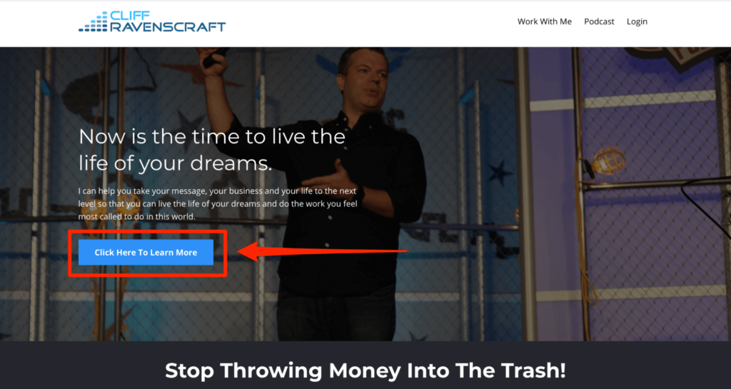
Ravenscraft also cuts right to the chase by telling the visitors what he can do for them. He has cleverly incorporated an eye-catching CTA to encourage them to learn more.
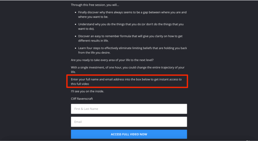
What we love best is how he leverages his Free The Dream podcast video to collect prospects’ email addresses—something he can use later to build his email list.
Ideas to Steal:
- Make sure your podcast website loads fast
- Add an eye-catching CTA towards the top of your website
- Offer a lead magnet to capture listeners’ email addresses
#2 The Being Boss Podcast
Originally founded by two women entrepreneurs, Kathleen Shannon and Emily Thompson, the podcast was taken over by Emily in 2020. With over 9 million downloads that serve a global audience of creative business owners, Being Boss focuses on what it takes to launch, grow, and run a business.
With a bold color gradient and a clear and informative layout, this is one of the better-looking and more user-friendly podcast website examples. The excellent homepage is divided into seven different sections, each with its own CTA, to allow users to browse through various topics and explore the podcast.
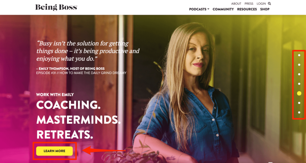
If the name wasn’t a dead giveaway, you’ll know the kind of topics Being Boss covers—business and entrepreneurship—by going through its landing page. We also like how it uses words like ‘strategies,‘ ‘business planning,‘ ‘productive,’ ‘coaching,’ and ‘masterminds,’ staying true to its niche.
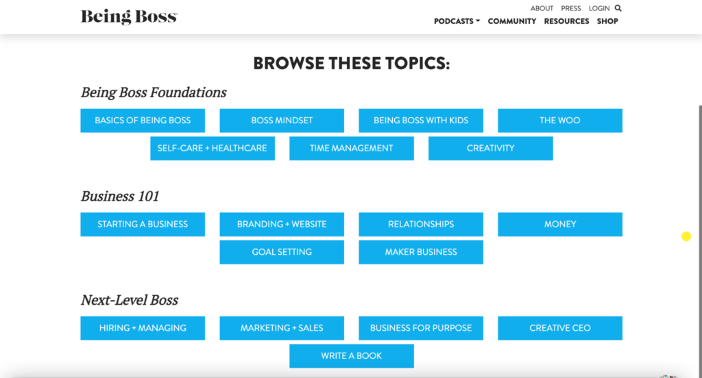
All the published content is stacked under different categories and subcategories to enhance navigability further.
Ideas to Steal:
- Break down your homepage into different sections
- Organize your content under different categories and subcategories
- Play around with bright and bold colors and gradients for a unique and attractive look
[convertkit form=2644196]
#3 The WPMRR WordPress Podcast
What started as a fun project by Joe Howard and Christie Chirinos quickly became one of the biggest podcasts in the WordPress niche.
The WPMRR WordPress podcast offers amazing advice for WordPress developers, maintenance professionals, writers, designers, and consultants. It features amazing guests with tons of experience to share, making it the go-to choice for anyone running a WordPress-based business and wanting to boost their monthly recurring revenue.
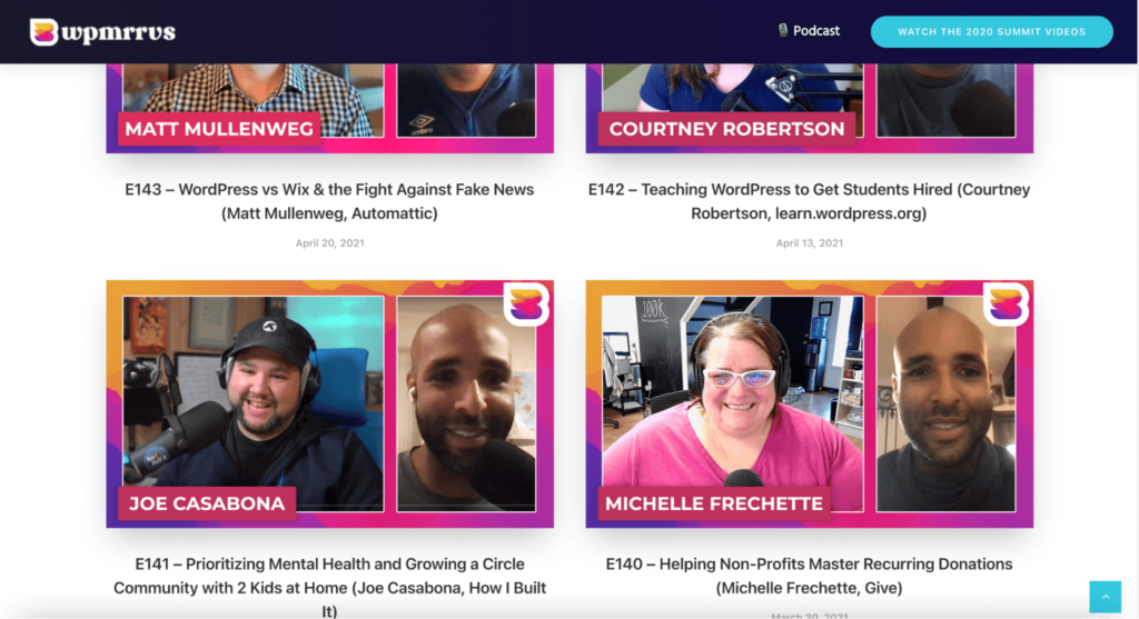
Every podcast is presented in a consistent style. You see a thumbnail of Joe with the starring guest, along with a descriptive label that tells visitors what the podcast is going to be about. A small search bar at the top helps streamlines search.
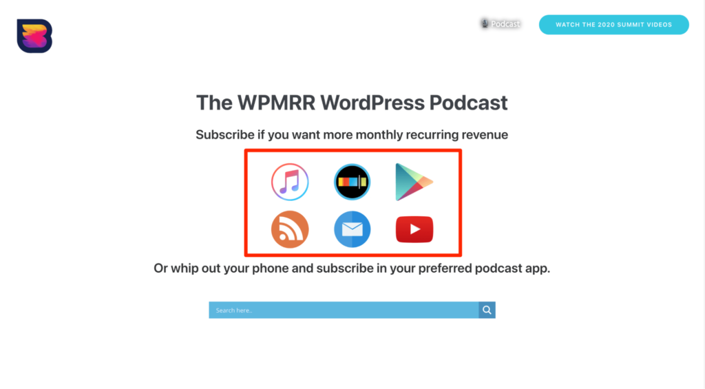
Including clickable application icons is another great strategy. Visitors can subscribe and listen to the podcast on any platform of their choice.
Ideas to Steal:
- Add attractive thumbnails and descriptive labels
- Include easy-to-click links to platforms where your podcast is available
- Add a search bar to simplify navigation
#4 The Myths, Folklore, and Fairytales Podcast
The Myths, Folklore, and Fairytales podcast is one of the more unique podcasts on our list—content-wise and design-wise—where Tanner Campbell retells old stories as podcast episodes in a bid to catalog them so they don’t get lost.
The website features beautiful artwork images that match the site’s branding and colors. As a result, everything blends together wonderfully.
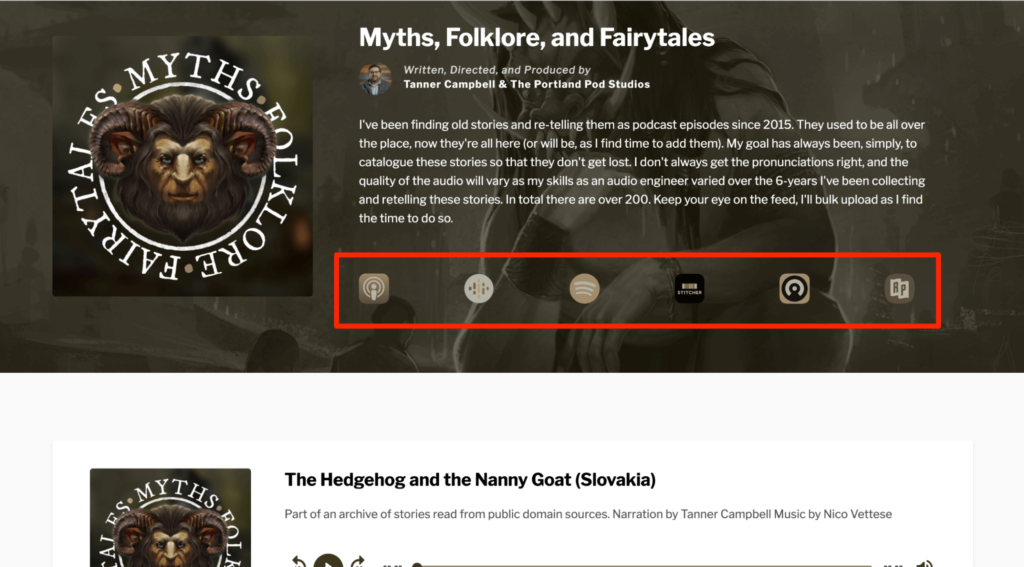
You can listen to these episodes free of cost by visiting the podcast website or on third-party post-podcast platforms like Apple Podcasts, Google Podcasts, Stitcher, Spotify, Castros, and Radio Public. There’s a clickable link for each of these.
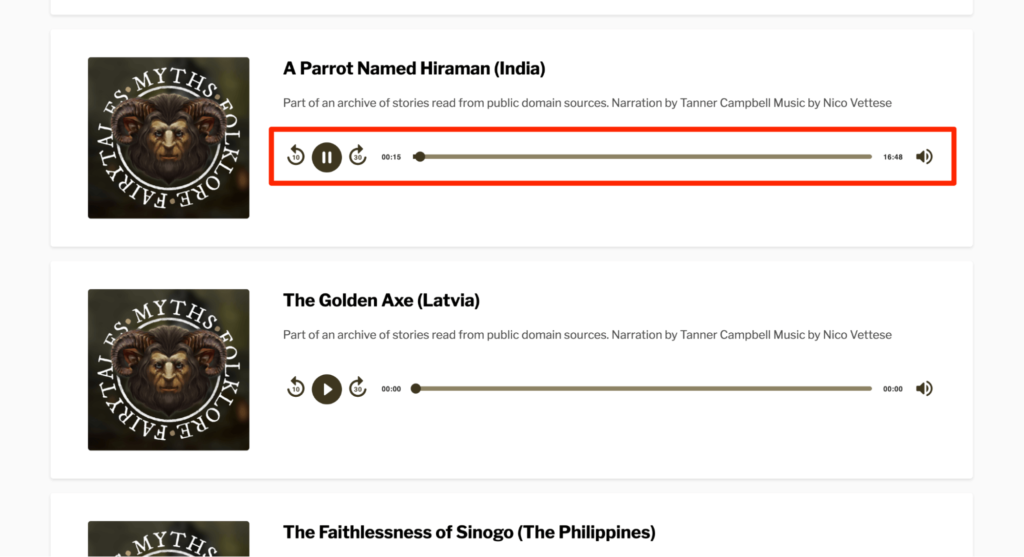
All the episodes include the story title, with a short one-line description of the source of the story, narration, and music. The most recent episode is displayed at the top, along with the different controls to play it.
The podcast also has excellent page speed and SEO scores. These help it make a good first impression on visitors and gain a higher search ranking, respectively.
Ideas to Steal:
- Allow visitors to listen to podcasts directly from the home page
- Create artwork that represents the podcast’s branding and colors
- Optimize website content for a higher rank in the SERPs
#5 The Smarter Sales Show Podcast
At first glance, you know the Smarter Sales Show is run by two women who offer sales-related advice. You don’t have to read any episode summary to understand it; this podcast website example informs you of that within seconds.

With a cheerful color scheme comprising yellow, orange, and white, the podcast looks inviting and has eye-catching animation across the homepage, complete with a subscribe button right below the header.
You can listen to the latest episode from the homepage, and browse others by clicking on the ‘Check out more episodes’ CTA. Although the website only features one episode on the homepage, you can consider displaying several on your’s if you want.
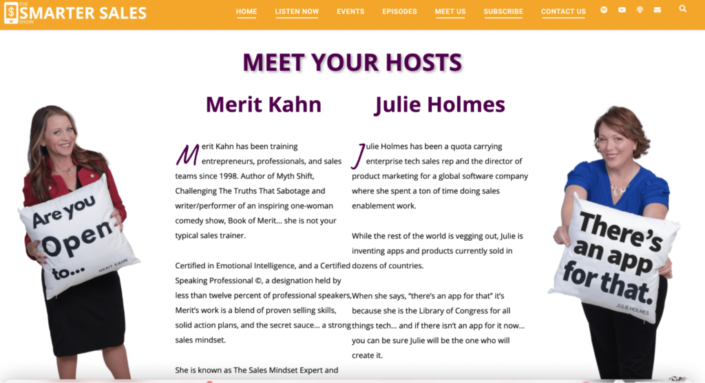
Their website also includes tons of information about the podcast and the hosts. Going through Merit and Julie‘s bios tells you that these are two people who have the experience and expertise to give you good advice.
Ideas to Steal:
- Add podcast hosts bios for more credibility
- Position opt-in forms towards the footer area
- Add a few animations for a fun effect—not too much as otherwise, you may lower your page loading speeds
#6 The Revisionist History Podcast
The owner of The Revisionist History Podcast, Malcolm Gladwell, reinterprets historical events and personalities (and even songs!) to understand whether we got it right the first time. His take is to analyze incidents and historical events from a different perspective.
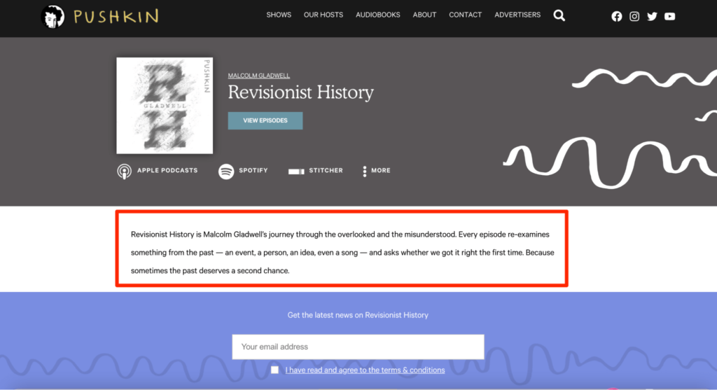
Considering the concept, Gladwell has definitely done a fantastic job at naming the podcast, managing to keep it both intriguing and unique. The website, too, has a very distinct look, designed to appeal to people interested in history and those wanting to explore past events from a fresh perspective.
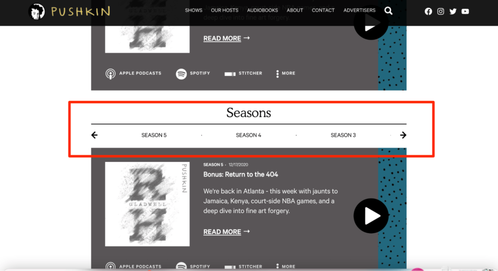
Design-wise, everything is very simple. The homepage just has a header image with tags for Season 1 to Season 5 so as not to overwhelm website visitors with unnecessary information.
Clicking on the season tags takes you to the different episodes that are labeled with more information about the topic discussed. Moreover, every episode has an accompanying thumbnail relevant to the topic, which adds personality to an otherwise straightforward design.
Ideas to Steal:
- Include an introductory paragraph at the top of your website
- Consider your target audience’s preferences when designing your website
- Include a section that lists podcast episodes according to season
#7 The It’s a Monkey Podcast
It’s a Monkey gives you the latest tech news and interviews with industry thought leaders—all presented in an easily digestible podcast format.
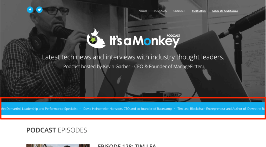
The website has a descriptive header image to inform visitors what it’s all about. You also see a news strip slide that mentions the names of all the impressive guests that have been on the podcast. A ‘Tweets from our listeners’ section lies towards the bottom.
Not only do these elements add eye-candy, but they also make the podcast appear authoritative and credible.
The website design is straightforward, mobile-optimized, and easily navigable.
You’ll see the latest episode followed by tags for the most recent episodes as you scroll down. Every episode is labeled and includes descriptive text so that visitors don’t have to guess what’s included in the content or feel overwhelmed.
Ideas to Steal:
- Mention guest names and tweets from subscribers to establish authority
- Include important points of discussion in your podcast episode labels
- Optimize your podcast website for mobile phones and tablets
#8 The This Week in Startups Podcast
This Week in Startups is a no-nonsense, effortless website designed for easy access.
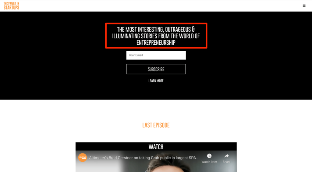
As soon as you open the website, you know exactly what the podcast is about — “The most interesting, outrageous, and illuminating stories from the world of entrepreneurship.” This one-liner tells users what to expect but also creates a sense of intrigue and mystery.
However, the main reason why This Week in Startups is on our list is because of its exceptional user experience.
You can scroll down to see the latest content that’s sorted according to different topics and industries, as well as years. One can see that all the content is easy to access and properly ordered.
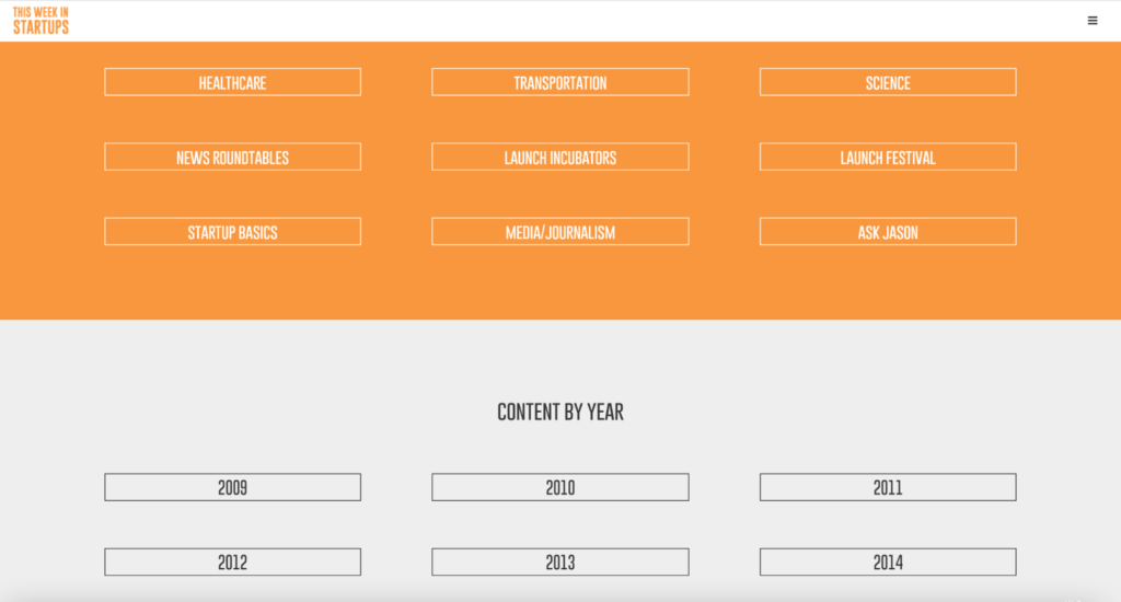
This podcast website example includes a list of partners and a link, which visitors can use to get “generous” software discounts for startup founders.
Ideas to Steal:
- Sort your content in different styles, namely years and topics
- Choose a one-liner that sets out expectations for customers while keeping the mystery intact
- Make all your content easy to access
#9 The Serial Podcast
The Serial is another one of our excellent inspirational podcast website examples.
As the website is custom-made, you can’t use the same platform or template to build yours, but it’s still an excellent source of inspiration to learn and borrow ideas from.
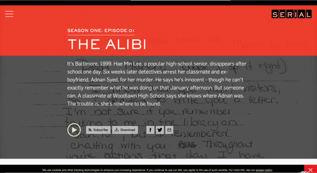
The main design and color scheme is great. The red and black background with white font complements the podcast’s theme well. You see a list of all the podcast episodes as you scroll down—all of which are easy to subscribe, download, and follow on social media.
Every episode has a brief summary that’s written in a way to compels the reader to hit play, along with a background image relating to the episode. These images are usually of the protagonists or evidence to add to the intrigue.
Including tags for Season 1 to Season 3 makes it easier to go through all the published content. There’s also a small menu bar on the side where visitors can browse through the different seasons and choose third-party platforms like Apple Podcasts, Google Podcasts, and Pandora to listen to episodes.
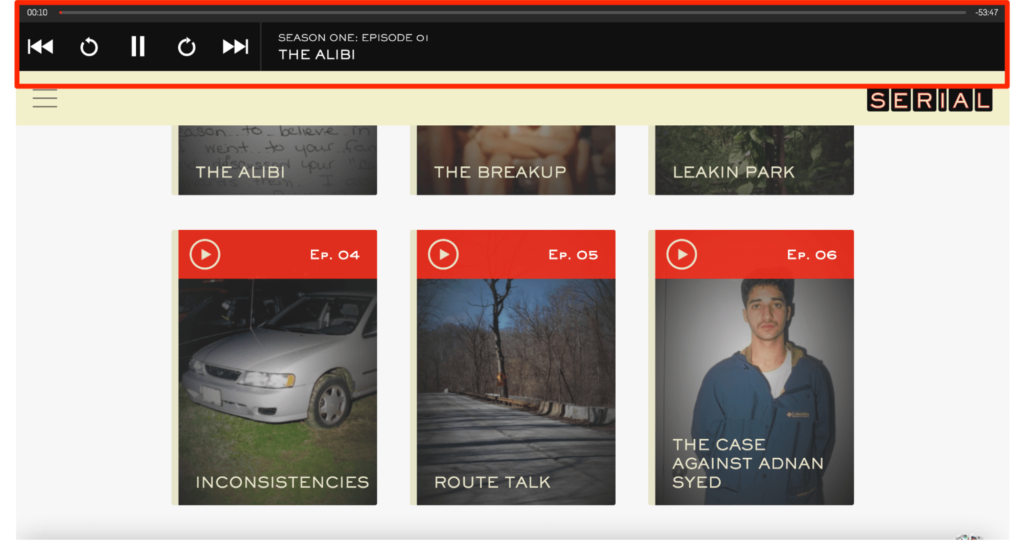
A sticky audio strip appears at the top when you click on the play button. This lets you continue reading more or navigate the site without stopping the episode.
Ideas to Steal:
- Incorporate a sticky audio feature for easy navigation
- Write podcast episode descriptions compellingly and include relevant keywords
- Make it easier for visitors to download your episodes and follow you on different social media channels
#10 The Undefined Terms Podcast
Just like the other podcasts on our list, Undefined Terms has a descriptive one-liner at the top — “Solving the world’s problems one definition at a time“.
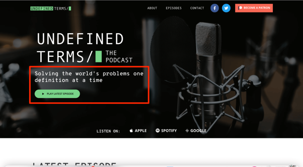
It gives you an idea about the kind of content the podcast will cover. The CTA button right below the one-liner is conveniently placed for past listeners who want to listen to the latest episode—or those trying out the podcast for the first time.
The overall website aesthetic is simple, clean, and minimalist. Visitors can browse the site and listen to podcast episodes via the on-page player. This also lets you visit other websites, which can be a handy feature for multi-taskers.
Listeners can subscribe to the podcast, as well as share episodes on different social media platforms, thanks to the various CTA buttons.
The homepage features three episodes, each complete with a short description and a thumbnail. Another interesting thing to note is how the website looks like it has different sections when in reality, it simply uses different background colors. An excellent technique to enhance navigability indeed!
A brief introduction about the host, Nick Nugent, towards the bottom of the homepage allows visitors to put a face to the voice.
Ideas to Steal:
- Use complementing color gradients to differentiate between different parts of your website
- Place clear and convenient CTA actions wherever it makes the most sense
#11 The Essie’s Hour of Love Podcast
Essie’s Hour of Love tries to explore love and everything related to it. It is unique in our list of podcast website examples by using a design that is purposely minimalist to make the black-and-white photographs of the guests the main focus of the whole website.
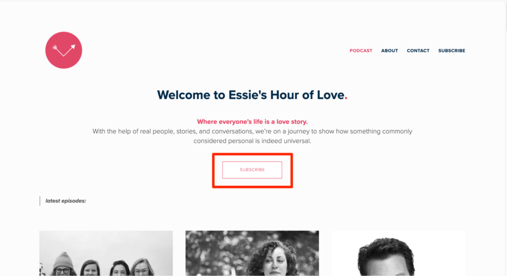
At first glance, you see the main header text that tells you about Essie’s Hour of Love, along with a subscribe CTA button. But instead of making it too eye-catching, the CTA button is simple and (wisely) placed away from the description to catch your attention.
You can use this as an inspiration to learn how to leverage white space to catch your visitor’s attention without using bright colors or a prominent element/animation.
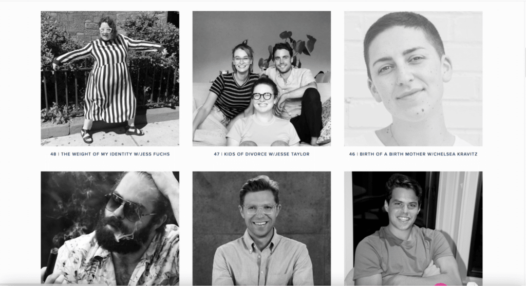
The website uses beautiful portraits of the guests—something that immediately strikes a chord—encouraging you to click to listen to their stories. Once you click on the episode, you’ll see a small description, alongside the image of the guest, that tells you what to expect.
Also, you can listen to the episode directly by clicking on the play button.
Ideas to Steal:
- Select a theme, and plan the entire website design around it
- Use large, high-resolution images of guests—B&W or color
- Use lots of white space
#12 The Mixergy Podcast
Mixergy gives listeners the opportunity to learn from proven entrepreneurs like Barbara Corcoran, Paul Graham, and Gary Vaynerchuk—their experiences, their struggles, and how they are where they are.
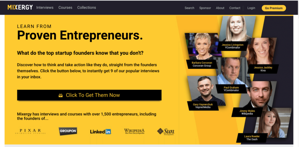
Talking about the website, the podcast has a nice color theme, with a clear CTA above the fold. Adding the images of entrepreneurs who have appeared on the website in the past adds lots of social proof.
Every podcast has a descriptive text that introduces the guest and mentions what they’ll talk about in the episode. This way, visitors can decide whether they want to continue listening to the episode or move on to the next one.
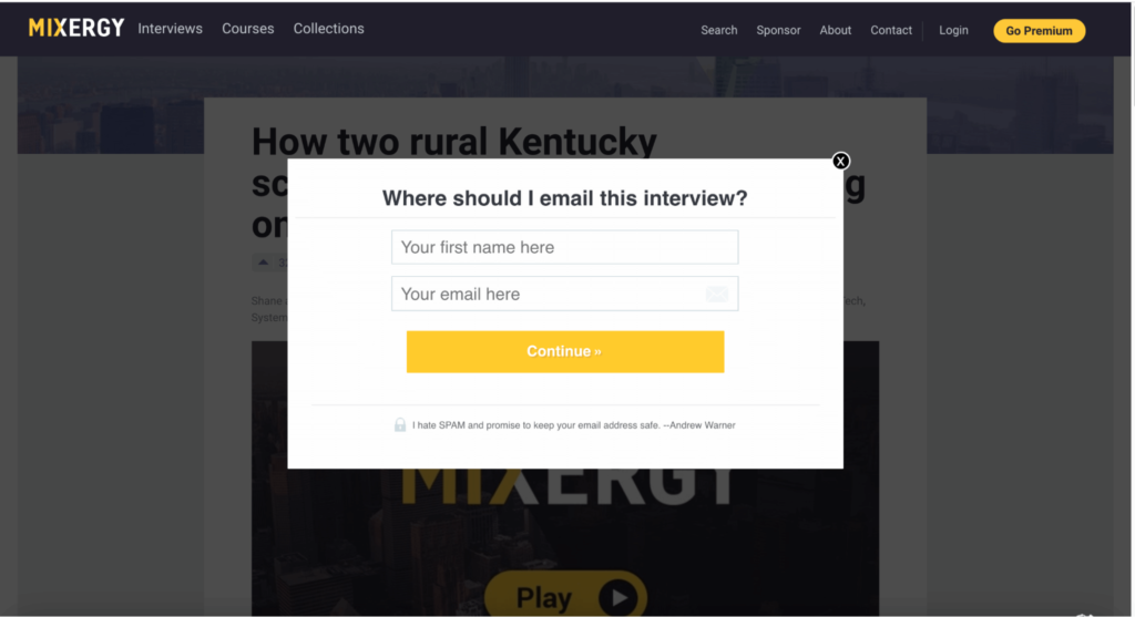
An opt-in form also pops up for selected content. You see, visitors are more likely to submit their names and email addresses if they receive something worthwhile in return—in this case, it’s access to the interview of their favorite entrepreneur.
Ideas to Steal:
- Include lots of social proof
- Display podcast episodes in an organized manner with catchy titles
- Add an email signup form
Over to You
Your podcast website can help you increase your subscriber list like no other. After all, it’s often the first impression a listener gets of your content.
That’s why it’s so critical to understand website best practices and optimize your website to establish instant trust with visitors and wow them enough to want to listen to your podcast, and even hit the coveted ‘Subscribe.’
The podcast website examples I’ve listed here do just that and illustrate firsthand the ideas you can use to ensure a superb visitor experience right off the bat.